Rover
Communicate better
Context: Personal project
Duration: 2023 - 2024
Tool: Figma
Rover is an app that connects pet owners with pet sitters.
As someone who supplemented her part-time income by pet sitting during the pandemic, there were several frustrations I experienced while using the app.
The Problem
In terms of functionality, the Rover app works pretty seamlessly. However, where the problem lies is in going back and forth within the app as client and sitter, and also when editing profiles. Some of the journeys are overcomplicated and have more lower-level pages than necessary.

Bookings
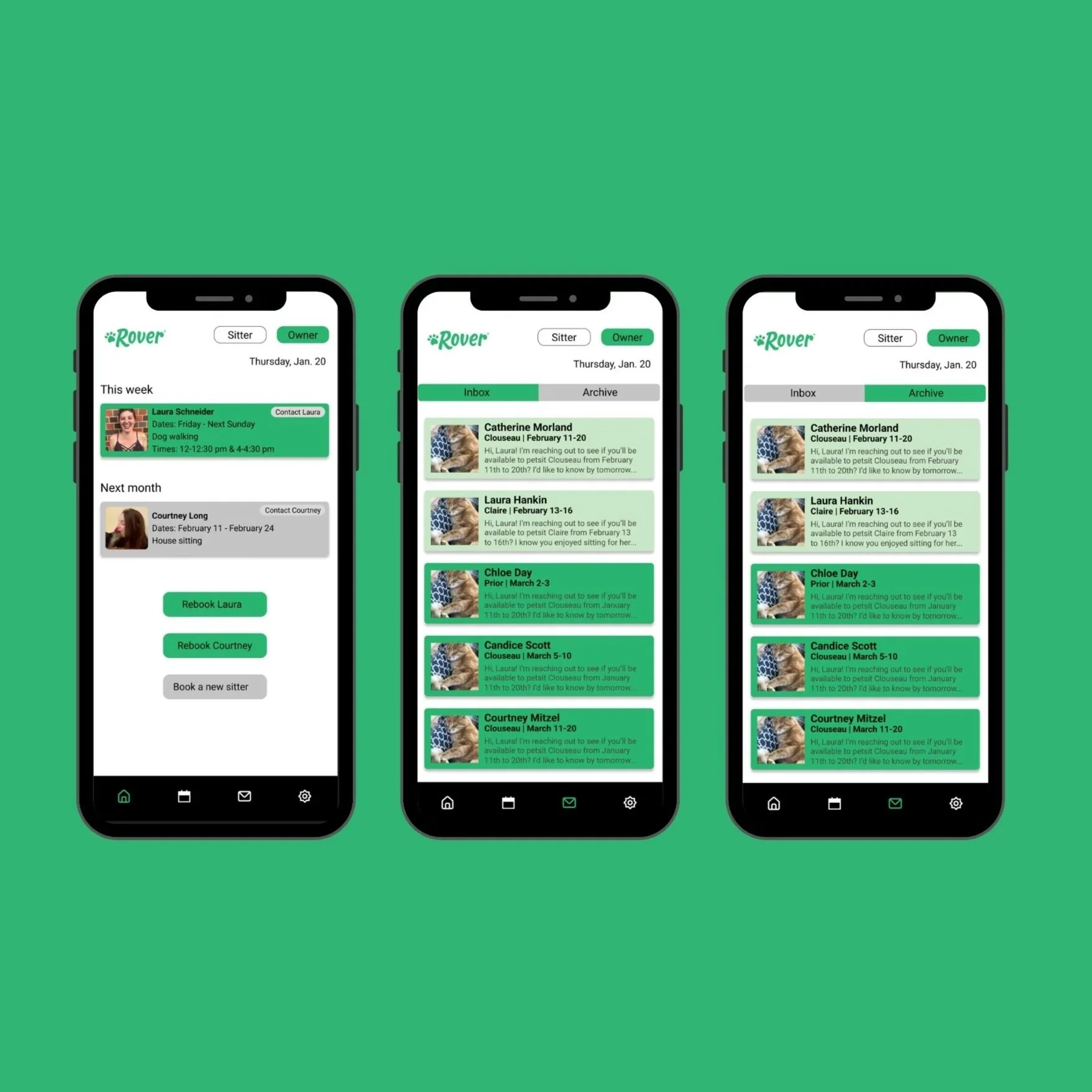
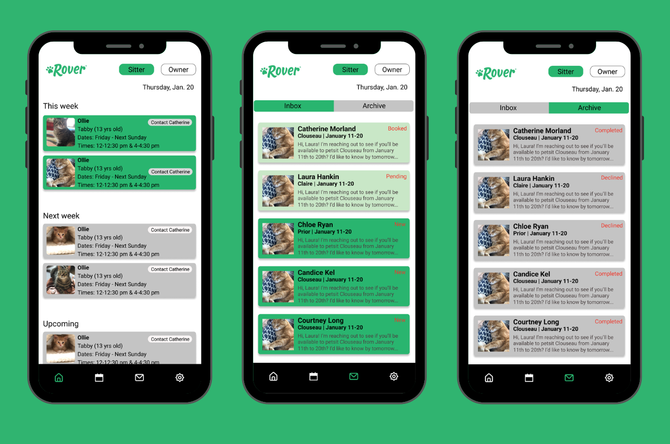
There is so much potential in the home’s interface. Instead of only seeing solely the current week’s bookings, my revamped pages allow pet sitters and owners to see all future bookings.
For pet sitters:
For pet owners:
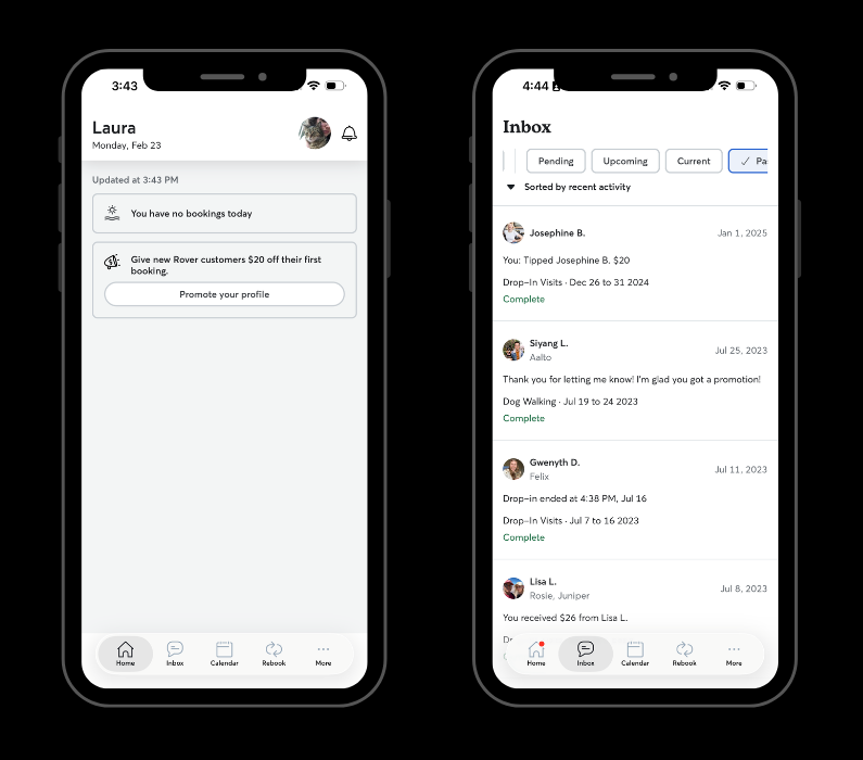
The current homepage and inbox for pet sitters - there is so much unused space on the homepage (even when there are active bookings), and neither the name of the app, nor the Rover logo is anywhere to be found.
Notice anything familiar? There is no difference between pages for pet sitters or owners, adding more confusion than clarity.
For pet sitters:
For pet owners:
My proposed redesign for pet sitters - the first screen is the sitter’s homepage with a complete overview of bookings. The Rover logo that is present on the website is present in the top left-hand corner. Instead of an overabundance of filters, there are scrollable inbox and archive pages. Branding colors are also implemented and make booked/pending/new/declined bookings more scannable.
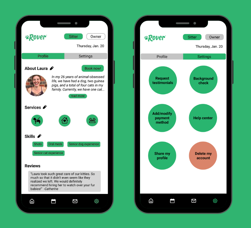
In this proposed redesign, the settings are more scannable, and instead of going into muti-lower-level pages for services and basic info, the profile can be viewed in real time upon editing various types of information.
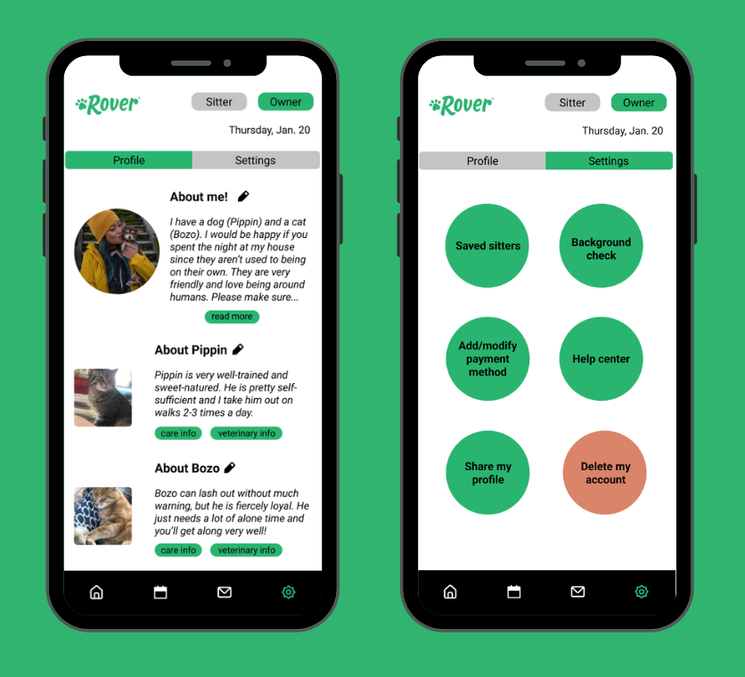
While more limited information is needed for pet sitters, it is still important for pet sitters to get a good idea who the person requesting services is like. In accordance with Jakob’s Law, the structure and usability is the same.
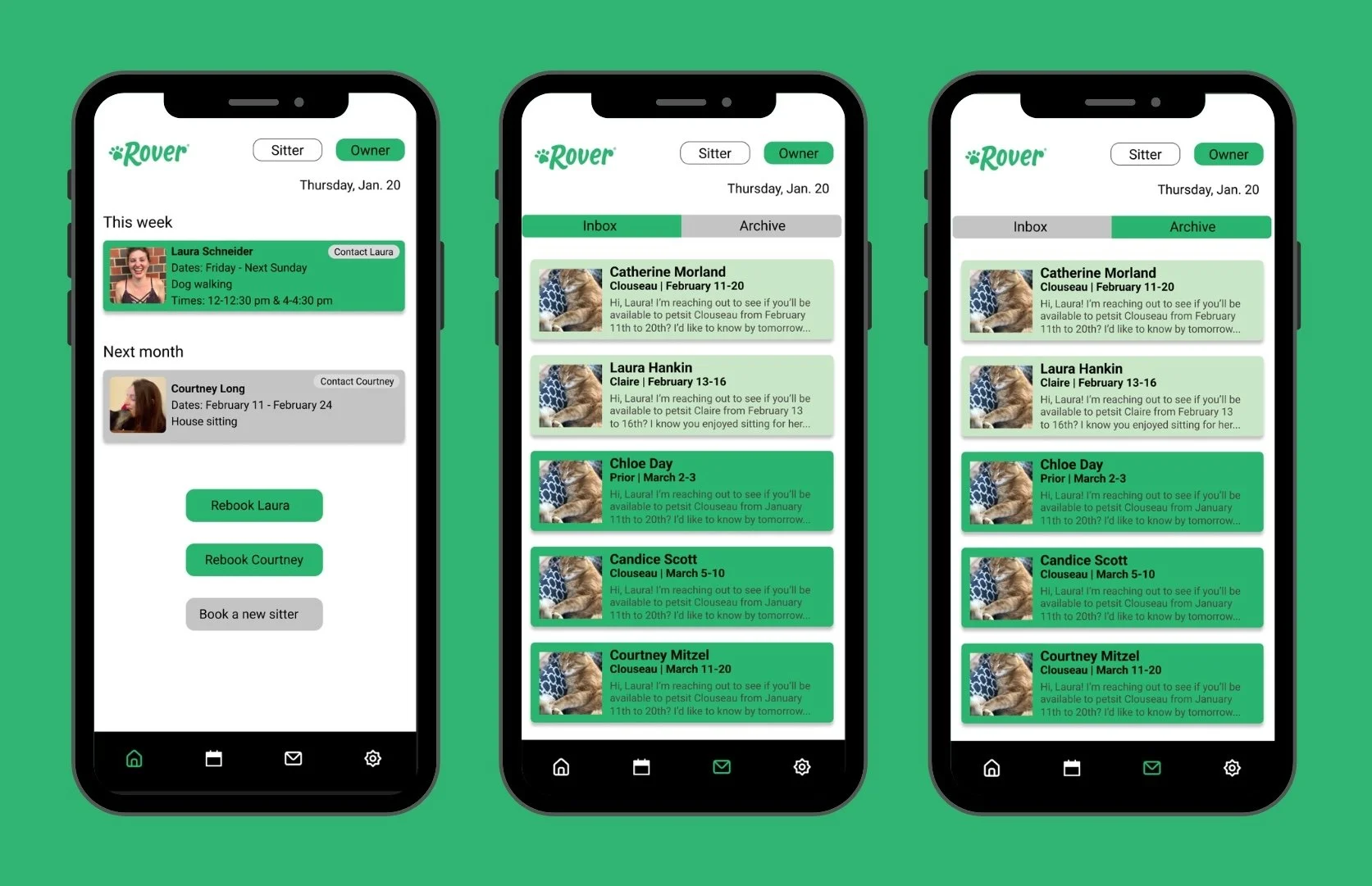
My proposed redesign for pet sitters - the first screen is the owner’s homepage with images of the pet sitters (rather than pets, as seen in the proposed sitter pages).
Editing profiles
There are way too many options on the current Rover page to know exactly where to go to edit one’s profile, so profile and settings have been separated in the the revamped design I have proposed. This allows for a more seamless and less frustrating process when editing information such as bio and services offered.
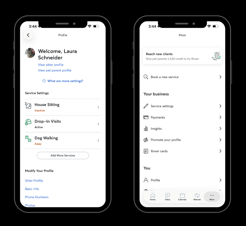
The listed settings here are definitely comprehensive, but in a way that could be organized a little more clearly.
The same familiar issue arises in settings - there is nothing differentiating the pet owner profile from the sitter profile. This is crucial if a user both requests and offers services on the app.
Proposed changes
As you will see throughout the following prototypes I have created, you will see that there is an easy way to toggle from “sitter” to “owner” at the top of every page. Note that the only way to do this in the current app is by
Insights
• Other improvements that should be made to the app are an itemized section for payment history.
• Although the competition is small (Wag being the only other app at this same level), it is still important to put more emphasis into branding and creating a more accessible app so pet sitters and owners will choose this one over the alternative. Nowhere in the current app is the logo reflected in the app itself.