Curl IQ
From scratch
Role: UX/UI Researcher & Designer
Context: Curl IQ
Duration: April 2021 - September 2021
Tool: Figma
Curl IQ, based in Washington, DC, revolves around an in-development hair recognition technology, which gives Black women the ability to understand and style their hair with or without the help of a stylist, simply through selfies.
As both a UX Researcher and the lead UX/UI Designer (intern from April to June; contracted designer from July to September), I was in charge of designing Curl IQ’s app, and for the duration of my position, I focused on delivering user-friendly and enticing onboarding, recipe, and browsing experiences, as well as sitting in on and assisting with user and usability interviews.
The Problem
As a white woman, I was not aware of the issue so many Black women face when trying to search for hairstyles specific to their curl type. It was only when I was working for Curl IQ and searching for stock photos to represent every curl type that I realized just how frustrating it must be to type in the phrase “black woman curl type 4” and have the majority of the results be white women with curly hair—or even straight hair!
This is just one problem Curl IQ has set out to solve. Using Curl IQ’s hair recognition technology, this app will give Black women the must-needed ability to not only find hairstyles that work for their hair type, but those of whom are not aware of their hair type will have it identified just from a few selfies.
My Role
The first week of my internship, I was given a list of ideas for what would be included in the app (I.e., blog, video channel, social content, courses), so I began to brainstorm and structure the app accordingly. I presented a wireframe two weeks after I was brought onto the team, and then had a separate meeting with my boss and the CEO, where we narrowed down what we wanted to focus on: the hair analysis experience.
In addition to leading the design of the app, I assisted with the user & usability interview recruitment process, and sat in on dozens of interviews to observe any user pain points, and get a better understanding of what users want out of the app.
Onboarding
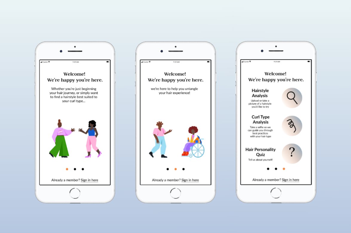
Goal: short, simple, straightforward, and enticing, with only a few calls to action at the end
Results: two screens with short, concise intros, and a third page with three calls to action: 1) hairstyle analysis, 2) curl type analysis, and 3) hair personality quiz
Browsing
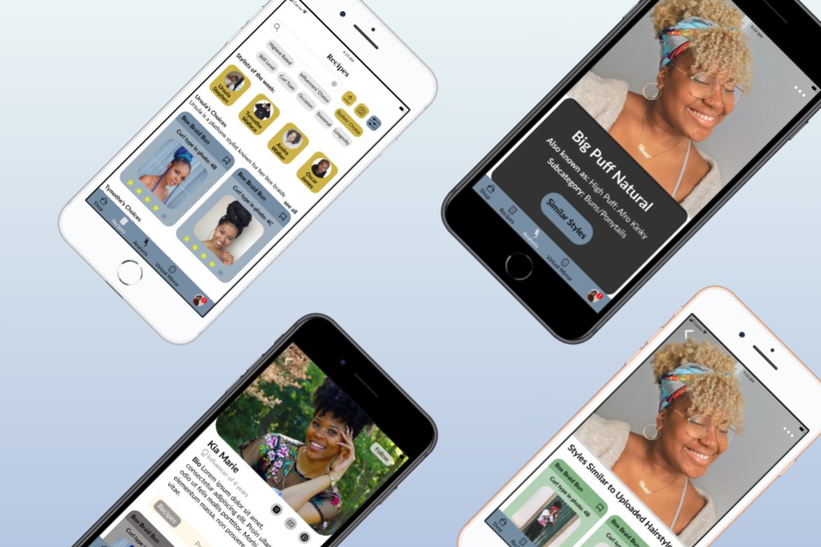
Goal: finding recipes based on 1) uploaded hairstyle, 2) influencer/stylist recommendations, and 3) using categories determined by user and usability interviews
Results:
Upload hairstyle > Browse similar styles
Browse the following categories: curl type, cost, activity, occasion, personality, prep time, styling time, take-down time, and longevity
Check out tips and recommendations from stylists of the week
High-Fidelity Prototype
(branding has been altered for confidentiality purposes)
Recipe
Goal: design an interface which would decrease the number of clicks on a recipe page, while including all necessary and desired information, based on user and usability interviews
Results:
Click hairstyle > Full-screen view of hairstyle with clickable icons on and surrounding the hair (Products, Tools, More Info) > Click “More Info” or swipe down > video and step-by-step tutorial; additional information such as time, skill level, and ratings.
Insights
Instill hair knowledge and confidence in Black women, especially those who prefer to DIY-style their hair.
Fewer distractions, and more straightforward calls to action: balance between spending time on the app, and quickly finding something so the user still has enough time to recreate their desired hairstyle.


